Analysis

Clutter and lack of clear direction

One of the first things I noticed about Yahoo’s homepage was how crowded the sides of the layout are. Ads, sidebars, and secondary widgets fight for attention, which makes the overall page feel noisy and “bland” at the same time.

Because so many elements are trying to stand out, none of them really succeed. The main headline competes with trending lists, weather, games, and more, all within the same visual weight.

Original Yahoo homepage with cluttered sidebars and many overlapping elements

No clear starting point

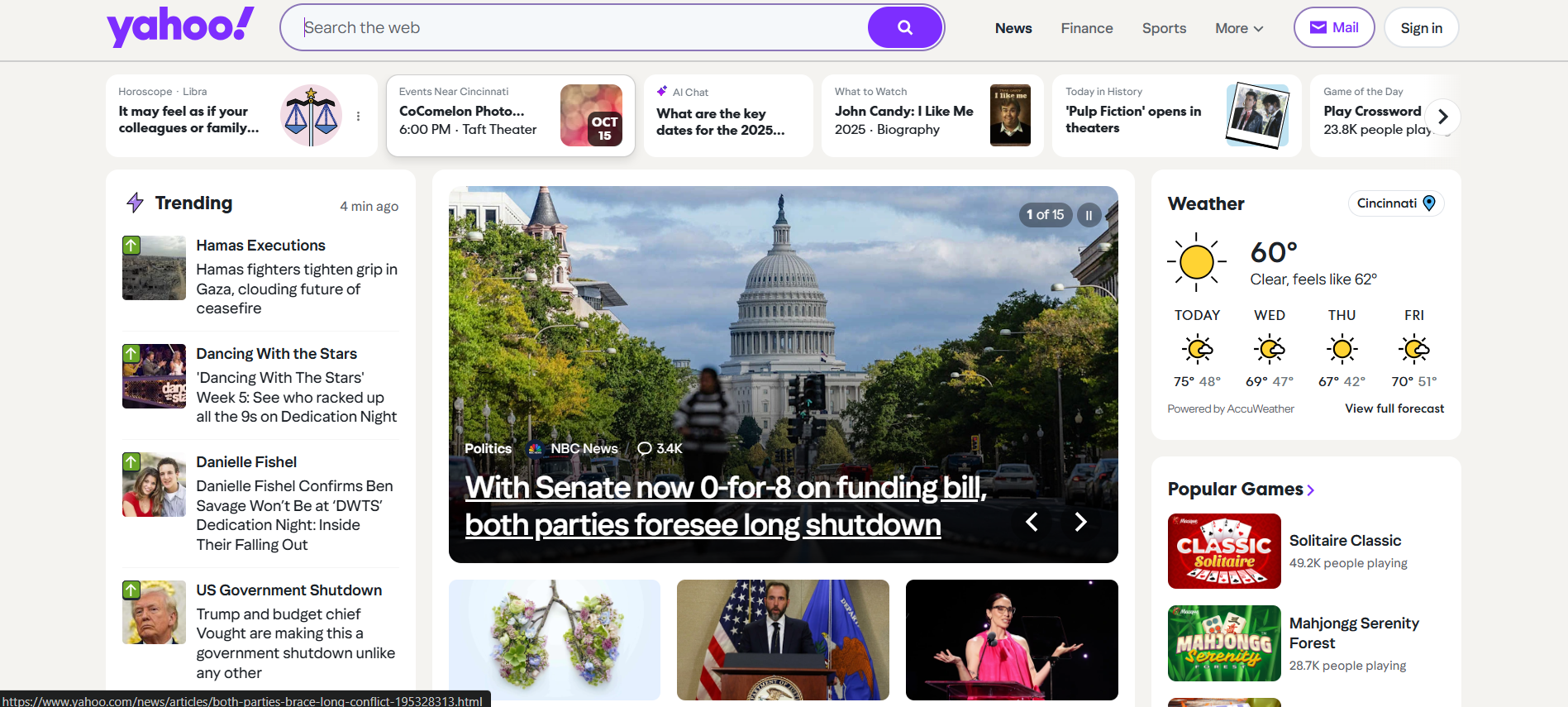
A good homepage tells the user where to start. On Yahoo, there isn’t a clear primary action. Do you read the main story, check email, scroll through trending topics, or look at the weather? The layout doesn’t answer that question.

Cognitive overload

As a viewer, you have to process a lot of information at once. Your eyes bounce around from box to box, and it’s easy to feel like you’re missing something important.

Improvement idea

  • Give the start of the web page a more of a POP.
  • Move secondary widgets below the fold instead of packing them into the sides.
  • Limit the number of “competing” items visible at the top of the page.