Analysis

Bland coloring and unbalanced layout

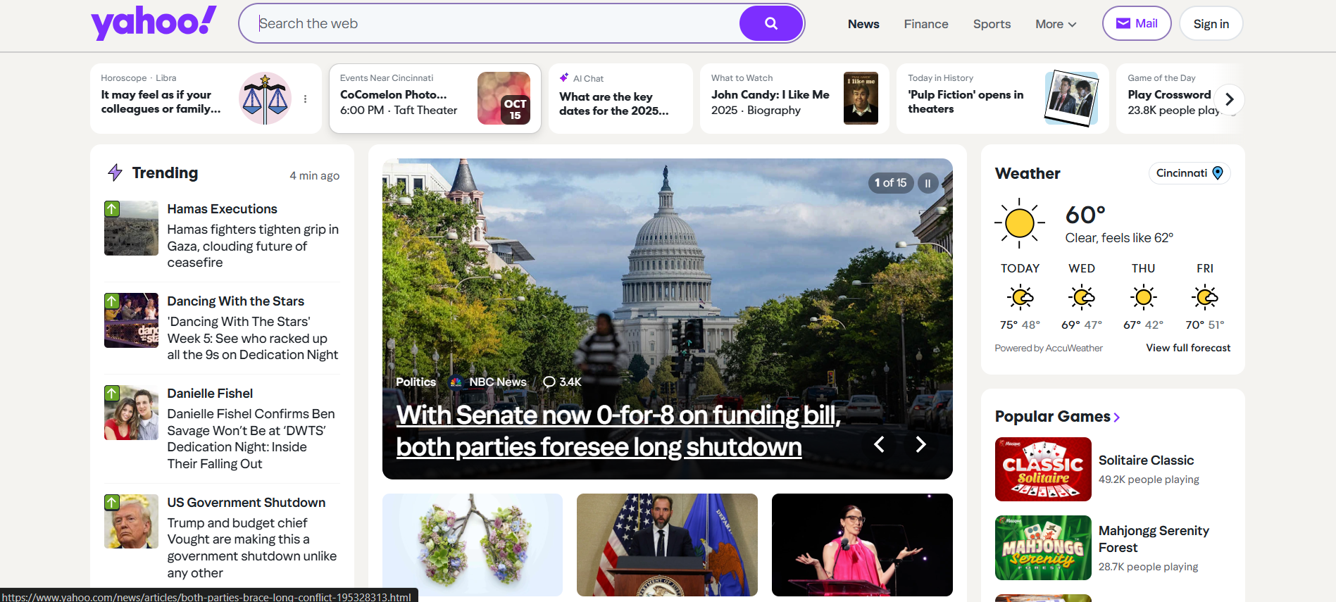
The current Yahoo homepage uses a lot of white space, but not in a way that feels intentional. Instead of acting as a calm background, it makes the page look flat and uninspiring.

At the same time, the layout is heavy on one side, with multiple narrow columns fighting for space. Weather, trending stories, and other widgets are squeezed into tall side panels that create visual imbalance.

Screenshot focusing on the white background and column layout of Yahoo

Color problems

  • Little contrast between different types of content.
  • No strong accent colors to guide the eye.
  • Important actions blend in with less important items.

Layout problems

  • Multiple narrow columns make scanning difficult.
  • Widgets feel randomly placed instead of grouped by purpose.
  • The page doen't lead one way or another which makes it feel more disinterested for the user .

Improvement idea

  • Use a subtle background tint to separate content from the page edge.
  • Adopt a simple 2-column layout with a clear primary column.
  • Reserve a strong accent color for key actions and links.