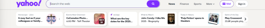
Style problems
- Logo and search bar feel detached from the rest of the layout.
- Visual style doesn’t reflect a modern, focused news experience.
- Color balance is off: accents appear random instead of intentional.
Analysis
I actually like the simplicity of the Yahoo logo, but on the current homepage it feels like the only element that really pops. Because the rest of the page is so bland, the logo and search bar look disconnected from everything else.
Overall, the page feels like an older 2000s website — lots of color, but not much personality or intentional flow from one section to the next. That was one of the biggest issues I wanted to tackle in the redesign.
In my redesign, the Yahoo logo becomes part of a consistent header that makes it more formal and better to read visually. Also making sure that it still can POP out for the crowd.